Domino’s Pizza is undergoing a rebrand for the first time in over a decade, and for once, people actually don’t hate it.
Featured VideoThe popular franchise announced the change on Wednesday, seemingly targeting a perpetually online audience where split-second brand recognition and going viral are imperative.
The Domino’s Pizza rebrand
The rebrand features a few different aspects. To start, it will be utilizing a new font called Domino’s Sans, and packaging its food up in boxes that are simpler, brighter, and bolder.
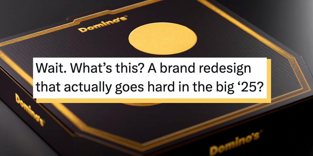
AdvertisementThe primary boxes are still the familiar red and blue, while premium options such as Handmade Pan and Parmesan Stuffed Crust pizzas sport a black and gold coloring. All of the pizza boxes are designed to resemble dominoes when two are placed next to one another.
They’re also introducing a jingle from Shaboozey and implementing the trademark “Dommmino’s,” because “you literally can’t say Domino’s without saying ‘mmm.’”
“It used to be that you could run a 30-second ad in primetime and that would be kind of all you needed to do,” Kate Trumbull, Domino’s chief marketing officer, told CNN. “Now, you need to catch attention in a second or two on TikTok or an Instagram Reel or YouTube, and when you have a jingle, you can get that instantly.”
AdvertisementStill, she told AdWeek that keeping the familiar red and blue rather than a full overhaul was imperative.
“It’s about enhancing what makes us great versus change for the sake of change,” she said.
The internet weighs in
A lot of rebrands in recent years have flopped, or, at the very least, received a lot of backlash from folks online. Some of the reasons are a little ridiculous, such as the utterly baseless and definition-abusing claim that Cracker Barrel’s failed (and reversed) rebrand was somehow “woke.” But others flop for a much simpler reason—they’re boring.
AdvertisementThat doesn’t seem to be the case with Domino’s. Sure, the “mmm” is a little goofy, but in a harmless way. At its core, the rebrand sticks to what’s familiar about the pizza franchise—bold red and blue coloring and imagery that calls up dominoes game pieces. More than that, it still has character.
“it feels like something you’d see in the 80s/90s,” one X user wrote. “bright, colorful, fun. I hope we see this happen to everything, minimalism needs to go away forever.”
That opinion generally seemed to be echoed online, where people shared their appreciation for the brand and these simple but bold changes.
Advertisement“Wait. What’s this? A brand redesign that actually goes hard in the big ’25?”
“Give a raise for whoever thought of the domino tiles as a box.”
Advertisement“i was gonna say ew but it’s kinda cool looks like dominos”
“Excellent brand refresh by Domino´s – clean, modern, transportable, high integrity. I don’t even mind the wordmark despite it being suspiciously Poppins – I think it fits the brand.”
Advertisement“I will always be a Dominos lover, this secures that”
And as one person pointed out, what matters just as much, if not more, is that they already did an upgrade of the actual pizza.
“As long as their recipe is the same as it has been since 2019-2020, I’ll still eat it,” wrote @silly_images.
Advertisement
 The Elder Scrolls 6 Will Feature a Memorial Character For a Much-Missed Fan, Following $85,000 Donation to Make-A-Wish