Domino’s Pizza is getting a fresh slice of style with an updated logo – and for the first time in its 65-year history, a jingle, too.
The pizza giant has announced a major rebrand, its first in over a decade, with new colors, a revamped logo, redesigned uniforms, and an updated font called “Dommino’s Sans.”
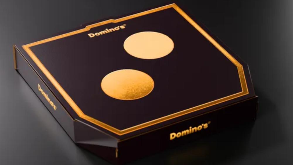
The refreshed look features brighter reds and blues for general packaging, while premium items like Handmade Pan and Parmesan Stuffed Crust pizzas will come in sleek black-and-metallic gold boxes.
The company even tweaked its name in select designs, adding an extra “m” to spell “Dommmino’s.”
“The brand took inspiration from its past and present and transformed it into modernized elements that will better reach current and future pizza lovers,” Domino’s said in a statement.
Chief Marketing Officer Kate Trumbull told CNN that the refresh is designed with short-form platforms in mind.
“It used to be that you could run a 30-second ad in primetime and that would be all you needed,” Trumbull explained. “Now, you need to catch attention in a second or two on TikTok or an Instagram Reel or YouTube, and when you have a jingle, you can get that instantly.”
Domino’s adds company song for first time in its 65-year history
To go with the visual overhaul, Domino’s is also debuting a company jingle — its first ever — sung by country artist Shaboozey. The song, called “Dommmino’s,” will feature across social media and TV campaigns in the coming months.
The full rollout will hit stores, packaging, and digital platforms through late 2025.
Whether customers embrace the change remains to be seen. Recent rebrands haven’t always gone smoothly.
Earlier this year, Cracker Barrel faced a tsunami of criticism when it removed its iconic ‘Old-Timer’ Uncle Hershel from the logo and began updating its locations with a more “modern” look.
After a wave of drama, the company folded under the pressure and reversed course, bringing back the old logo and canceling the remodeling efforts.
Domino’s will be hoping its new era is a hit with fans and doesn’t end up falling… like dominoes.
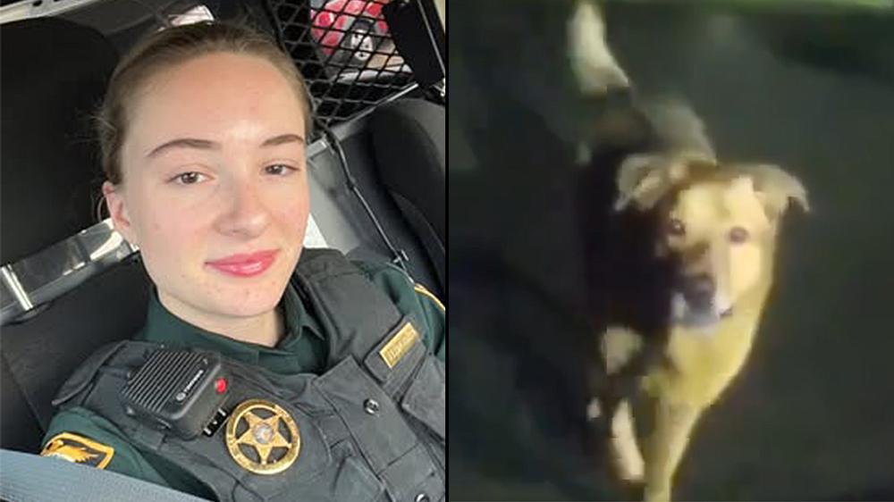 Dog leads deputy to fallen grandmother in viral police bodycam footage