Pepsico has changed its logo for the first time in 25 years, but its new look is leaving consumers confused.
Pepsico is undergoing a major rebranding, which first kicked off when the company unveiled a brand-new look for Lay’s Potato Chips in early October.
The chips will no longer be packaged in the bright yellow bags Americans have come to know and love over the years. In fact, they’re even getting made with new formulas as Pepsico seeks to lean in a healthier direction.
This big shift in branding was just the beginning for Pepsico, it seems, as the company has now gotten a shiny new logo for the first time in 25 years… but it might be a little too different from what customers are used to.
New Pepsi logo is a huge change from the original
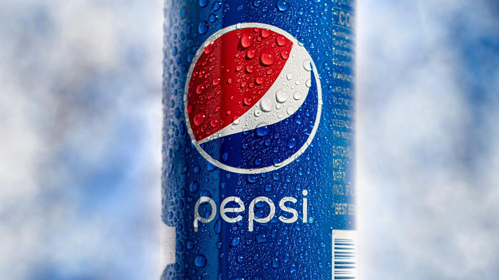
Pepsico revealed their new look on November 3, 2025. Rather than the iconic red, white and blue sphere that’s slapped on cans of the soft drink, their logo now features a white, lowercase ‘p’ surrounded by an orange leaf, a green streak, and a blue drop, along with a slogan beneath that reads, “Food. Drinks. Smiles.”
This is the biggest change Pepsico has made to its logo over the company’s 60-year history. A graphic created by the brand shows how much the artwork has changed over the years.
From 1965 – 2001, Pepsico’s logo featured the red and blue sphere in some way. In 2001, those colors were used as accents on a globe next to the word ‘Pepsico.’ Now, the red and blue coloring is completely absent, as is the block-style lettering often used in its branding.
Pepsico detailed the logo change in a blog post, explaining that their new look is “more than just a logo — it’s a symbol of transformation that captures the energy, optimism and ambition of PepsiCo in 2025 and beyond.”
“While our business has grown and transformed in many ways, our corporate brand has remained the same for nearly 25 years. Today, we’re proud to introduce a new brand identity — one that reflects who we are now and the future we’re building together.”
PepsiCo Chairman and CEO Ramon Laguarta also gave a statement on the change. “Our new identity boldly reflects who we are in 2025: a company with expansive reach, aiming for positive impact across the globe and an unmatched family of beloved food and drink brands,” he said.
The company broke down the meaning behind their new logo, explaining that the orange leaf represents “food / grains,” the green streak is a “smile,” the blue drop represents “drinks / water,” and the light green leaf beneath the Pepsi ‘p’ is meant to evoke “making a positive impact for people and the planet.”
 Kodak Quietly Begins Directly Selling Kodak Gold and Ultramax Film Again